There’s an aspect of being a software engineer or programmer in general that I think most people outside of the field don’t really think about. We spend a lot of time staring at text editors and terminal windows and those invariably use monospaced fonts, that is, every character in the font takes the same amount of space, vertically and horizontally.
Most fonts you see on a regular basis are known as proportional fonts, because the characters width is proportional to the character, but in a monospaced font, the width is always the same. That means that the letter “l” will take up the same space as the letter “M”. In a monospaced font, that looks like: l and M.
Why we use monospaced fonts is a story for another time, but since we spend so much time looking at code, we get pretty picky about our fonts. There are lots of different concerns at play. Pratical ones like making sure that similar characters like 5 and S are different enough, that you don’t mix up 1, I, and l. Stylisic ones like how the f looks (e.g. does it have a tail) or if the italic versions look like cursive handwriting.
Lately programming fonts have started using coding ligatures like => which is just = and > or |> which is | and >, which some people like while other’s don’t.
Terrible monospaced fonts
There are some terrible monospaced fonts that provide the standard typographical ligatures, e.g. the “fi” ligature, which is usually a special version of those two characters because the “f” will collide with the dot of the “i” and without the liagture it looks bad.
These are absolutely disasterous in a monospaced font because they’re usually implemented in the space of a single character, which is not what the coding ligatures do. They aren’t even needed because in a monospaced font, the characters won’t intrude on each other’s space and lead to the problems that ligatures correct.
A catalog of fonts I’ve used
Recently I switched to using Iosevka, which is a highly customizable font and kinda checks a bunch of boxes for me, but I wanted to also mention the fonts I’ve used in the past. This is mostly in a reverse chronological order, and I’m probably leaving some out that I’ve forgotten.
Iosevka
Iosevka is interesting because it isn’t a single font but a huge font family. I’ve seen versions of this font that look very different from the one I’m using.
My customized variant of Iosevka is what you see on this site in code snippets and in any monospaced blocks of text. I really appreciate how it is so customizable that I can get something distinct and interesting with little work. It doesn’t have everything I want in a font, but it’s nice. I don’t like it’s default width so I went with the slightly wider version.
I like how it has options that somewhat match my own personal handwritting style. *My personal style is based on 19th century documents and loosely on English Roundhand styles that were taught in schools then. For example, I can get numbers like 1 and 7 the way I write them, as well as Z and z. I’ve had people mistake my 1’s for 7’s before, but you put them next to each other and they’re very clearly different. The 1 also looks very different from I and l. There’s also the Q with a swish, and f with a tail that I like.
The danger with it though is that because it’s so configurable, I could spend a lot of time switching options as my tastes change, but hopefully that won’t happen too often.
I’ll see how long I stick with it, since eventually I get bored with looking at the same font and switch to another one. I might also play with trying to distinguish the italic version more, but right now it’s roughly the same.
My Iosevka Configuration
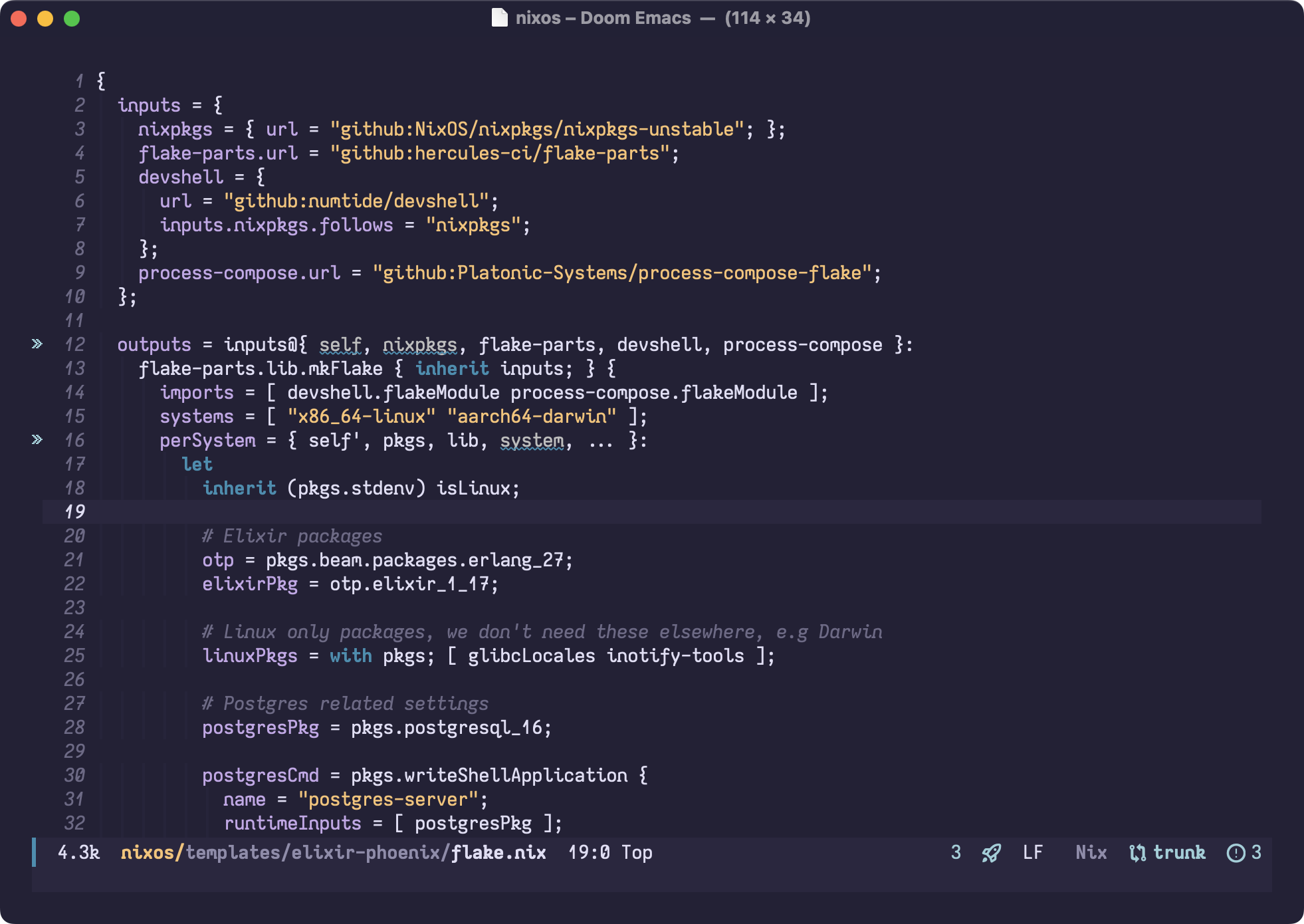
I’m using Nix to build the font which makes it really easy to modify, so my configuration for it is in Nix code, but you can easily recreate the TOML configuration off of it, as the keys map directly 1-to-1.
iosevka.override {
  set = "Codingkoi";
  privateBuildPlan = {
    family = "Iosevka Codingkoi";
    spacing = "normal";
    serifs = "sans";
    noCvSs = false;
    exportGlyphNames = true;

    ligations.inherits = "dlig";

    widths = {
      Condensed = {
        shape = 500;
        menu = 3;
        css = "condensed";
      };
      Normal = {
        shape = 600;
        menu = 5;
        css = "normal";
      };
      Extended = {
        shape = 720;
        menu = 7;
        css = "expanded";
      };
    };

    slopes = {
      Upright = {
        angle = 0;
        shape = "upright";
        menu = "upright";
        css = "normal";
      };
      Italic = {
        angle = 9.4;
        shape = "italic";
        menu = "italic";
        css = "italic";
      };
    };

    variants = {
      inherits = "ss20"; # Curly style
      design = {
        capital-d = "more-rounded-unilateral-serifed";
        capital-p = "closed-motion-serifed";
        capital-q = "open-swash";
        capital-r = "curly-top-left-serifed";
        capital-z = "curly-serifless-with-crossbar";
        f = "tailed";
        g = "double-storey-open";
        i = "tailed-serifed";
        k = "cursive-serifed";
        l = "tailed-serifed";
        m = "earless-single-arch-short-leg-bottom-right-serifed";
        n = "earless-corner-tailed-serifed";
        q = "diagonal-tailed-serifless";
        z = "curly-serifless-with-crossbar";
        long-s = "bent-hook-tailed";
        zero = "broken-slash";
        one = "no-base-long-top-serif";
        seven = "curly-serifless-crossbar";
        asterisk = "penta-low";
        paren = "large-contour";
        brace = "curly-flat-boundary";
        number-sign = "slanted-open";
        ampersand = "lower-open";
        at = "compact";
        dollar = "interrupted";
        question = "smooth";
        micro-sign = "toothed-bottom-right-serifed";
      };
    };
  };
}
Comic Code
The elephant in the room of this list, let’s talk about Comic Code. I’ve used this one off and on in the past year. I appreciate its whimsical style, and while it’s inspired by the most reviled proportional font of all time, I think it’s different enough to carve out its own space. It’s not free though, so you have to pay for it if you want to use it. My one complaint with Comic Code is that its coding ligatures are kinda weird. I don’t like the <= ligature it uses because it’s extra wide filling all of the available space.
Recursive Mono
I was introduced to this one by a friend of a friend who was really in to fonts in general. We were having a discussion about the serif font called Poliphilus *At one point I wanted use that font on this site for the body text, but it doesn’t really work as well on screen as it does in a book. used in the copy of The Dispossessed that I have from Folio Society, and somehow we got on the topic of monospaced fonts.
I specifically used the “casual” variant of this one, for all the reasons that I use some of the more whimsical fonts in this list. It’s a good font choice, and it was the font I used on this site for monospaced text before changing to Iosevka.
Victor Mono
I really like Victor Mono’s italic style which is very cursive, but I’m not the biggest fan of its regular style. It has a few things I like but it’s a little too serious for my tastes.
It’s not a bad choice though, so I keep it in my list of possible choices.
Dank Mono
There appear to be some rendering issues on MacOS with this font, see the tail of the “g” and the top of the “f”. It doesn’t occur on Linux
I’m not sure how I found Dank Mono, since it’s a non-free font that you have to pay for. Its italic style is somewhat cursive like Victor Mono though not quite as far as that font. I like the descender on the “f” of this font, and I know that’s a contentious statement, because a lot of people seem to hate it. After seeing Comic Code on this list, it shouldn’t be a surprise though.
Monofur
Looking at it now, I’m not sure I like it given how similar the { and ( are. I prefer the more exaggerated { that some fonts have.
Monofur is a font with very rounded sans-serif characters. It has a little bit of a Comic Code vibe except that the characters are all consistent, with less variation. It’s an okay font, though I haven’t used it in years.
Input Sans
This one is actually interesting because while it does have a monospace font, it also has a proportional font designed for programming (two, one sans-serif, the other serif). I used Input for a while years ago and got some strange looks from the people I worked with at the time. I didn’t try using this in a terminal, where monospaced fonts are much more strictly required, but for the most part it was nice for code editing tasks. It obviously broke any ASCII art diagrams in code comments, and mabye that’s actually a good thing, since those are hard to maintain.
Many others long forgotten
I’ve tried so many monospaced fonts over the years that I don’t remember them all. I’m sure at some point I was using Courier New back in my Visual C++ 6 days, when I was first learning to program.
Try different ones out, change them as your mood guides you. There isn’t going to be one true font.